

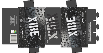
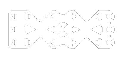
The Shape of the packaging makes the product easy to distinguish on the shelf from other brands, highlighting the ‘X’ shape from the product name ‘XIBE’. This new and different packaging allows the audience to see more of the can surface, also helping for brand recognition and the display of graphics on the cans.
The carry finger slots at the top of the packaging allow for a good grip, whilst also tying back to the ‘X’ shape. This is just another element of the design that makes it unique from six can beverage packaging currently on the market.
The packaging requires no glue, but rather the use of a tab system to create the structure. This is both environmentally friendly and recyclable. The material used for the packaging is Amcor carrier board 500um, specified for use within the brief.
No comments:
Post a Comment