Wednesday, June 8, 2011

Inclusive Design: Assignment Three


Rationale: SENCE Faucet.

In understanding the brief for this assignment, The concept of universal design must be defined. Universal design, is the process of designing for the inclusion of a wide variety of abilities and disabilities. Goldsmith (2000, p. vii.) states “Universal design is about making buildings safe and convenient for all their users, including people with disabilities”. This idea may be extended to the application of consumer products and the interactive utilizations of such.

Under the philosophy of Universal Design there is an evident requirement to “...design for the vast majority of a target population rather than everyone” (Beecher & Paquet 2004, p. 1). Through the consideration of this definition, focusing on an audience of abled, disabled, child and elderly users, the design for the Sence tap was developed.

Sence is a mixer-sensor tap designed to save water within the home. The name was derived from the ‘sensor’ activation within the design, while also relating to the fact the design makes ‘sense’ as it saves water. With the development of this design, function played a major role in the solution to inclusive design. The design resulted in a functional and aesthetic faucet suitable to the users within the intended audience.

During the design process, anthropometric data was taken into consideration, to ensure the design was inclusive of a vast majority of the population. For example, in considering wheelchair bound users - The maximum forward reach range for a person seated in a wheelchair is 1200 mm, and the minimum forward reach ranges in height from 250 mm specified by Australia to 700 mm specified by the Philippines. The maximum forward reach over an obstruction is 500 mm.” (Dion 2006, p. 9).


The sensor functions using infer-red detection, where the tap is only activated if hands are placed in front of the sensor. A sensor sends a signal to the control box, where the water is turned on or off. This works to save water, as the tap is not left running when not being used. The sensor integration eliminates the need to touch or adjust the tap if undesired. This increases hygiene, as the user does not have to touch the tap to activate it.

The clean lines and easily accessible handle make this design approachable, user-friendly and easy to clean as there are no ‘hard to reach’ areas on the tap. The combination of both mixer and sensor concepts can be justified by the aspiration to give the user freedom to choose their desired water pressure and water temperature when using the tap.

The large, wide handle design allows less able-bodied user such as the elderly or those with arthritis to push and pull the handle as opposed to grabbing and twisting. This lever handle can also be operated by the elbow or forearm. The design of the tap was developed with consideration of the Caroma range, and was therefore developed in that style.


Sunday, April 17, 2011

Project 2 - Packaging


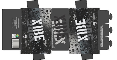
XIBE is a new mixed drink on the market targeting a male audience aged between 18 and 25. The name XIBE was chosen, as it represents a youthfulness ‘vibe’ with an x-factor. The dark colours used within the packaging relate to both the target audience, and the drink itself, being a bourbon and coke. The image of condensation droplets that dominates the packaging persuades the audience that the product is both refreshing and cold.

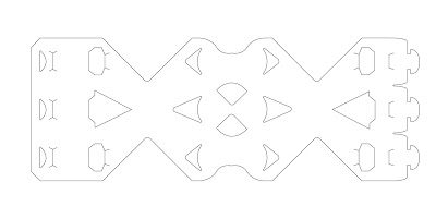
The Shape of the packaging makes the product easy to distinguish on the shelf from other brands, highlighting the ‘X’ shape from the product name ‘XIBE’. This new and different packaging allows the audience to see more of the can surface, also helping for brand recognition and the display of graphics on the cans.

The carry finger slots at the top of the packaging allow for a good grip, whilst also tying back to the ‘X’ shape. This is just another element of the design that makes it unique from six can beverage packaging currently on the market.

The packaging requires no glue, but rather the use of a tab system to create the structure. This is both environmentally friendly and recyclable. The material used for the packaging is Amcor carrier board 500um, specified for use within the brief.

Project 1 - Sheet Materials


The brief for this project required the design and manufacture of a house-hold or home-office product fabricated with sheet material. Being an interesting and manipulative material, I chose to design a stool to be made from 4mm thick sheet aluminium.

The fractal shapes on the seat of the surface are an abstract depiction of the bubbled surface that occurs on a latte that has been sitting for too long. The design is suitable for use as a stool for sitting or a small coffee table. The design would be more substantially admired if used as a coffee table.